
This is content
Grid Item 1
Grid Item 2
Grid Item 3
Grid Item 4
 瀏覽:593
How often do you use media queries when building web layouts? I’ve spent too much time on them!
First you spent quite a lot of time trying to make the layout exactly like in the design. But then you need to resize your browser to all possible screen resolutions to make sure your page still looks good on all of them. And I mean to resize not only by width, but by height too - especially, if you have full height sections.
Eventually, your CSS become full of lines like these:
@media screen and (max-width: 1199px) { /*styles here*/ }
@media screen and (max-width: 1023px) { /*more styles here*/ }
@media screen and (max-width: 767px) { /*another styles here*/ }
And that’s annoying! Won’t it be much easier if you can include responsiveness kind of like automatically? Of course, you still need to provide the rules for the responsiveness, but without need to write them for dozens of screen resolutions.
The first thing you need to understand about responsive design is that you have to forget about pixels.
I know it might be hard to switch from one unit to another, but using pixels is the voice from the past.
The biggest problem with using pixels as a size unit is that you don’t get in count the user's device from which it views your website.
The default root font size for modern browsers is 16px. That means 1rem = 16px. But that doesn't mean users cannot change that value in browser settings to whatever they want.
So imagine the user's default browser font size is 24px. But you setted up the font size of the body tag to 16px.
Here’s what user expects to see:

Root font size equals 24px
And this is what user actually sees:
Root font size equals 16px
It especially affects people with vision problems, thus your page won’t be very accessible for them.
Of course, they can always zoom your page, but in this case it will affect other opened websites, which may not be supposed to be zoomed in.
BTW, the Lorem Ipsum site is a very “good” bad example of how non UX-friendly a page can look if you’re using pixels for fonts, margins, paddings etc.
If you're not familiar with the relative units like rem and vw, you should check this article on the MDN, where you can deep dive into CSS units and values: https://developer.mozilla.org/en-US/docs/Learn/CSS/Building_blocks/Values_and_units
To make it easier to build the layout, let's set up global variables first. Luckily, in CSS we have that opportunity. Since custom variables are subject to the cascade and inherit their value from their parent, we will define them on the :root pseudo-class, thus they can be applied to the whole HTML document.
:root {
  --primary-color: green;
  --primary-font: Helvetica, sans-serif;
  --text-font-size: clamp(1rem, 2.08vw, 1.5rem);
}
Looks pretty simple - we define a variable name, which must begin with a double hyphen (--). Then provide a variable value, which can be any valid CSS value.
Then we can use those variables for any element or even pseudo-class in the document using the var() function:
color: var(--primary-color);
For example, we can use our --primary-color variable for all the headings on the page like this:
h1, h2, h3, h4, h5, h6 {
  color: var(--primary-color);
}
Since the primary colour will use quite a lot of different elements on the page, it’s very handy to use the variable instead of writing each time the colour itself.
The last variable --text-font-size: clamp(1rem, 2.08vw, 1.5rem) might look odd: what’s the clamp and what’s it doing on the font size variable?
The clamp() CSS function clamps a middle value within a range of values between a defined minimum bound and a maximum bound.
You need to provide a minimum value (which is 1rem from the example above), a preferred value (2.08vw) and the maximum allowed value (1.5rem).
The most tricky part here is to set the preferred value. It should be in some viewport relative units (like vw or vh). Thus when a user resizes its browser or changes the device’s orientation the font size will scale proportionally.
I’ve made this formula for calculating the preferred value:
value = AMValue * remInPx / (containerWidth / 100)
Here comes an explanation, no panic:
AMValue - arithmetic mean, between the minimum and maximum allowed values in rem. In our example it equals (1rem 1.5rem) / 2 = 1.25rem
remInPx - default size of 1rem in pixels, depending on your design, usually it equals to 16px
containerWidth - the maximum width of your content container block (in pixels). We need to divide that value to 100 to get the 1% of the width. In the example it equals 960px.
So if you replace the arguments in that equation with real numbers you will get:
value = 1.25 \* 16 / (960 / 100) = 2.08
Let’s check how it will scale:
I know it’s not a perfect solution. Besides, we attach again to pixels, when calculating the preferred value. It’s just one of many possible options to make our fonts scale between viewports sizes.
You can use other CSS functions like min() or max(), or create a custom method to calculate the preferred value in the clamp() function.
I wrote an article about dynamic font size scaling, only for pixel units. It’s a bit outdated, but still you might find it helpful:
Dynamic font-size using only CSS3
Ok, enough of the fonts, let’s go further to the layout!
Let’s start with some simple layout with 6 equal columns.
With media queries you need to write a bunch of extra CSS code to handle how they should wrap on different screen sizes. Like this:
/* by default we have 6 columns */
.column {
  float: left;
  width: calc(100% / 6);
}
/* decrease to 4 columns on the 1200px breakpoint */
@media screen and (max-width: 1200px) {
  .column {
    width: calc(100% / 4);
  }
}
/* decrease to 3 columns on the 1024px breakpoint */
@media screen and (max-width: 1024px) {
  .column {
    width: calc(100% / 3);
  }
}
/* finally, decrease to 2 columns for the viewport width less than or equal to 768px */
@media screen and (max-width: 768px) {
  .column {
    width: calc(100% / 2);
  }
}
Woah! That’s a lot of code, I must say! Wouldn't it be better to just make it scale automatically?
And here’s how, thanks to the CSS grid layout:
.row {
  display: grid;
  grid-template-columns: repeat( auto-fit, minmax(10em, 1fr) );
}
All we need to do is to set the parent block of our columns to be displayed as a grid. And then, create a template for our columns, using grid-template-columns property.
This is called RAM technique (stands for Repeat, Auto, Minmax) in CSS, you can read about it in more details here:
RAM Technique in CSS
In that property we use the CSS repeat() function.
The first argument is set to auto-fit, which means it FITS the CURRENTLY AVAILABLE columns into the space by expanding them so that they take up any available space. There’s another value for that argument: auto-fill. To understand the difference between them check this pen:
Also, I highly recommend to read this article from CSS tricks about auto sizing columns in CSS grid: https://css-tricks.com/auto-sizing-columns-css-grid-auto-fill-vs-auto-fit/
The second argument is using another function minmax(), which defines the size of each column. In our example each column should not be less than 10em and should be stretched to the remaining space.
Looks fine, but we have a problem - the number of columns can be bigger than 6!
To make a limit of columns, we need some custom formula again. But hey, it’s still in CSS! And it’s not that scary, basically, you just need to provide a gap for the grid, a minimal column width and the max number of columns.
Here’ the code:
.grid-container {

  /** * User input values. */
  --grid-layout-gap: 1em;
  --grid-column-count: 4;
  --grid-item--min-width: 15em;

  /** * Calculated values. */
  --gap-count: calc(var(--grid-column-count) - 1);
  --total-gap-width: calc(var(--gap-count) * var(--grid-layout-gap));
  --grid-item--max-width: calc((100% - var(--total-gap-width)) / var(--grid-column-count));

  display: grid;
  grid-template-columns: repeat(auto-fill, minmax(max(var(--grid-item--min-width), var(--grid-item--max-width)), 1fr));
  grid-gap: var(--grid-layout-gap);

}
And here’s what we achieve with that:
As you can see, we can use the relative values for the columns min width and gap, which makes this code like the perfect solution. Until they build the native CSS property for that, of course ?
Important notice! If you don't need a gap between columns, you need to set it to 0px or 0em, not just 0 (pure number). I mean you have to provide the units, otherwise the code won’t work.
I’ve found that solution on CSS tricks, so in case you want to dive deeper to how that formula works, here’s the original article about it: https://css-tricks.com/an-auto-filling-css-grid-with-max-columns/
The solution above works perfectly for the grids with equal width of the columns. But how to handle layouts with unequal columns? The most common example is a content area with a sidebar, so let’s work with this one.
Here’s a simple markup of the content area along with sidebar:
This is content
For the .content section let’s use the flex box layout:
.content {
  display: flex;
  flex-wrap: wrap;
  justify-content: space-between;
  gap: 1rem;
}
The flex-wrap property here is important and should be set as wrap in order to force the columns (sidebar and content area) stack under each other.
For the sidebar and content columns we need to set flex properties like grow and basis:
/* Sidebar */
.content > aside {
  border: 1px solid var( - primary-color);
  padding: var( - primary-padding);
  flex-grow: 1;
  flex-basis: 15em;
}

/* Content */
.content > article {
  border: 1px solid var( - primary-color);
  padding: var( - primary-padding);
  flex-grow: 3;
  flex-basis: 25em;
}
The flex-basis property sets the initial size of the flex item. Basically, it’s a minimum width which the flex item should have.
The flex-grow property sets the flex grow factor — similar to the proportion of the flex item compared to the other flex items. It’s a very rough and approximate explanation, to understand better the flex-grow property I highly recommend to read this article from CSS tricks: https://css-tricks.com/flex-grow-is-weird/
So if we set the flex-grow: 1 for the sidebar and flex-grow: 3 for the content area, that means the content area will take approximately three times more space than the sidebar.
I also added the grid section from the previous example to demonstrate that it works inside the flex layout as well.
Here’s what we have in the final result:
It’s pretty common, when you have a grid layout where text comes next to image on one row and then in reverse order on the next row:
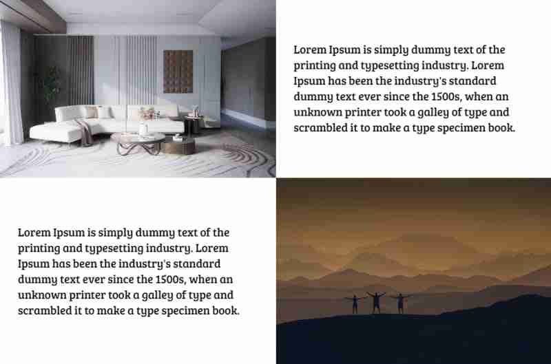
But when the columns become stacked you want them to be in a specific order, where text comes always before image, but they don’t:

To achieve that we need to detect somehow when the columns become stacked.
Unfortunately, it’s impossible (yet) to do that with pure CSS. So we need to add some JS code to detect that:
/**
* Detect when elements become wrapped
*
* @param {NodeList} items - list of elements to check
* @returns {array} Array of items that were wrapped
*/
const detectWrap = (items) => {
  let wrappedItems = [];
  let prevItem = {};
  let currItem = {};

  for (let i = 0; i  {
  const items = wrapper.querySelectorAll(":scope > *");

  // remove ".wrapped" classes to detect which items was actually wrapped
  cover.classList.remove("wrapped");

  // only after that detect wrap items
  let wrappedItems = detectWrap(items); // get wrapped items

  // if there are any elements that were wrapped - add a special class to menu
  if (wrappedItems.length > 0) {
    cover.classList.add("wrapped");
  }

};
The function addWrapClasses() accepts two arguments.
The first one is wrapper — it’s a parent element of the items which we should check whether they are wrapped (stacked) or not.
The second argument cover is an element to which we apply a special CSS class .wrapped. Using this class you can change your layout when the columns become stacked.
If you want to apply the .wrapped class directly to the wrapper element you can pass the same element as the second argument.
For better understanding my “wonderful” explanation please see the pen below, hope it will become more clear for you:
You can also use it to detect when the header menu should be collapsed into the burger. You can read about that case in my article here:
An Easy Way to Make an Auto Responsive Menu
Here’s a pen with all the techniques I mentioned in this article combined:
I’ve used the techniques from this article in my recent project and it worked very well. The web pages look fine on every screen with no need to optimise them manually on multiple breakpoints.
Of course I will be lying if I tell you I didn’t use media queries at all. It all depends on the design and how flexible you can be with modifying page layout. Sometimes it’s much faster and simpler just to add a couple of breakpoints and then fix CSS for them. But I think eventually CSS media queries will be replaced by CSS functions like clamp() which allow developers to create responsive layouts automatically.
If you find this article helpful — don’t hesitate to like, subscribe and leave your thoughts in the comments ?
Read more posts on my Medium blog
Thanks for reading!
Stay safe and peace to you!


免責聲明: 提供的所有資源部分來自互聯網,如果有侵犯您的版權或其他權益,請說明詳細緣由並提供版權或權益證明然後發到郵箱:[email protected] 我們會在第一時間內為您處理。
Copyright© 2022 湘ICP备2022001581号-3


