
使用 CSS @starting-style 動畫對話框和彈出框元素
 瀏覽:905
Written by Rahul Chhodde✏️
Native dialog and popover elements have their own well-defined roles in modern-day frontend web development. Dialog elements are known to communicate with the user and collect their inputs, while popovers are more apt in providing low-priority secondary info to the user.
In a previous article about dialogs vs.popovers, we discussed that both these elements have their dedicated JavaScript APIs that allow us to make the most out of these two elements.
When it comes to adding animations and interactivity to these elements, JavaScript libraries are preferred over CSS. Such elements typically require minimal animations, and using huge animation libraries merely to add a few simple effects can significantly increase the unnecessary load on your app.
To remedy that, this article will help you code animation effects into dialogs and popovers using pure CSS techniques. We'll cover CSS keyframes and the newly introduced @starting-style at-rule, both of which can be used to create subtle animations with improved performance.
The problem with animating overlay elements
Dialogs and popovers are overlay elements, which means they operate on the topmost layer rendered by the browser. As discussed previously, these elements also rely on dedicated APIs to manage their display and/or modality.
Let’s look at the challenges we face when animating dialogs and popovers using traditional CSS transition techniques.
Dependence on the display property
CSS in general doesn’t allow you to transition a discrete property like display from one value to the other. This means that the standard opacity zero to 100 percent approach for creating transitions won't work either, as the display property does not permit delays between value switches for transitions to complete.
If you inspect the computed display property of the dialog and popover elements, you’ll notice how the browser intelligently manages it without any additional effort on our part, except for using the methods provided by APIs of the respective elements: 
Note: The computed display for popover element in DevTools doesn’t update automatically for some reason. You have to select a different node and then reselect the popover node to see the updated value.
As displayed above, the on-screen visibility of the dialog and popover elements is handled by the browser internally using the CSS display property.
The following demo illustrates how the dependency of the dialog and popover elements on the display property makes the standard CSS transition approaches ineffective for them:
See the Pen Opacity/Visibility transitions doesn't work with dialogs and popovers by Rahul (@_rahul) on CodePen.
Before concentrating on opacity and transformations to create transitions, we should consider the display property first, which governs how the associated elements are displayed on the screen.
Lack of initial styles before rendering
Another problem with overlay elements is the lack of initial styles, which is crucial to ensure proper transition for elements that are dynamically added to the DOM or have their visibility controlled dynamically with the display property.
Let’s say our element should fade in while it renders on the web page. In this case, we need to set the element’s initial opacity to zero, and then transition it to 100 percent once it completely renders on the page. The only initial state we usually have available to us is the present state of the elements, which if provided an opacity of zero, would make the element disappear on screen.
To turn this into a functional effect, we can use JavaScript to add programmatic delays, class switching, or CSS keyframe animations to emulate a transition-like effect.
In the upcoming sections, we will explore ways to address the display property’s inability to support transitions and the lack of initial element styles before rendering.
Transitioning discrete CSS properties
As discussed above, dialog and popover elements rely on the display property for their visibility on the screen, making them nearly impossible to animate using CSS transitions.
The display property is of discrete nature, which means it changes abruptly between values. For example, it might change from block to none without considering the delay defined in the transition-duration. This is because there are no logical intermediate states between such values, as we see with properties accepting additive values like opacity, width, height, and others.
To make discrete properties compatible with CSS transitions, a new transition property called transition-behavior has been introduced that allows you to make transitions behave in a certain way, especially for discrete elements that don’t have additive values in numeric form, pixels, or percentages.
Instead of transitioning smoothly between values, the allow-discrete behavior postpones the change from one discrete value to another until the specified transition-duration has elapsed:
.dynamic-display {
  transition: opacity 0.5s, translate ..., display 0.5s allow-discrete;
  ...
}
In the above snippet, the allow-discrete behavior ensures the display values will wait for half a second, as specified by the transition-duration, instead of switching abruptly.
This delay in switching discrete values allows transitions for other properties with additive values enough time to complete their job:
See the Pen allow-discrete transition-behavior in action by Rahul (@_rahul) on CodePen.
With the allow-discrete transition behavior, we now understand how the exit transitions can be added to elements whose rendering or display is managed dynamically. However, the entry transition will not function in the absence of pre-render styles. The next few sections will explore a couple of techniques for adding entry transitions.
Animating dialogs and popovers with CSS keyframes
So far we have learned how to incorporate exit transitions to dynamically added and managed elements, and now we will apply the same technique to dialogs and popovers.
Let’s start by declaring both the entry and exit animations and examine how CSS keyframes can be effective in adding somewhat of an entry point for transitions to any element, regardless of its display.
Adding entry animation with CSS keyframes
Using CSS keyframes to mimic the starting styles for elements is simple. We'll start with adding entry and exit animations for both the elements as well as the backdrop for the dialog element.
Let's add some CSS keyframes to create a subtle fade-in and fade-out animation for the elements. Note that we need to define the keyframes for the elements and their respective backdrop (pseudo-element) separately:
/* Keyframes for dialog and popover elements */
@keyframes fadeIn {
  from { opacity: 0 }
  to { opacity: 1 }
}
@keyframes fadeOut {
  from { opacity: 1 }
  to { opacity: 0 }
}

/* Keyframes for the backdrop pseudo-element */
@keyframes backdropFadeIn {
  from { background: hsl(0 0% 0% / 0%) }
  to { background: hsl(0 0% 0% / 50%) }
}
@keyframes backdropFadeOut {
  from { background: hsl(0 0% 0% / 50%) }
  to { background: hsl(0 0% 0% / 0%) }
}
We can now use the above animation keyframes in different parts of our elements. We can also target the open state of our dialogs and popovers with the [open] attribute and the :popover-open pseudo-class as shown in the following code snippet:
.my-dialog {
  animation: fadeOut 0.5s forwards;
  &::backdrop {
    animation: backdropFadeOut 0.5s forwards;
  }
  &[open] {
    animation: fadeIn 0.5s forwards;
    &::backdrop {
      animation: backdropFadeIn 0.5s forwards;
    }
  }
}

.my-popover {
  animation: fadeOut 0.5s forwards;
  &:popover-open {
    animation: fadeIn 0.5s forwards;
  }
}
If we combine the above code snippets and use them in a dialog and a popover element, the outcome will resemble the demonstration shared below. This technique is great for entry animation, but it completely skips the exit animation part:
See the Pen HTML5 Dialog and popover entry animation w/ CSS keyframes by Rahul (@_rahul) on CodePen.
If you have an eye for micro-interactions, you'll notice that the fading-in entry animation works well when opening the dialog box, but upon closing or cancelling it, the fading-out exit animation doesn’t seem to work. Let’s learn why in the next section.
Adding exit animations to the dialogs and popovers
The reason why the exit animation isn’t working in the above demo is the abrupt change in the computed display of the elements due to the popover and dialog APIs. We previously discussed how the transition-behavior property helps us manage discrete CSS properties alongside transitions. Let's try using the transition-behavior property in this scenario to see if it resolves the issue.
See the Pen HTML5 Dialog and popover entry & exit animations w/ CSS keyframes by Rahul (@_rahul) on CodePen.
Fortunately, adding the allow-discrete behavior to the display and overlay properties has resolved the exit animation issue. Both the entry and exit animations are now working correctly.
In production, this approach ends up in a much bigger code with two to three vendor-specific variations for each block of animation declaration. The effects we implemented here are not too complex and could have been achieved using CSS transitions if it weren't for the dialog and popover elements.
CSS keyframes are best intended to create keyframe animations, but they do not offer pre-render optimization even though they may seem to. However, with the newly introduced @starting-style at-rule, we can achieve transition-based effects without using CSS keyframe animations.
What is @starting-style at-rule in CSS?
Earlier we discussed how DOM-dependent elements require a starting point for initial styles to transition from, and that’s exactly what the new @starting-style CSS at-rule delivers.
The @starting-style at-rule is a CSS Transition Level 2 feature used to declare starting values for properties on a transitioning element, starting from its first style update.
The following syntax allows you to specify a starting point for the styles of a given element from which the transition will pick up and operate. The properties included within the selectors of this at-rule should be the ones that will be involved in the associated transitions:
@starting-style {
  .selector {
    opacity: 0;
    ...
  }
}
Try re-rendering the element dynamically in the below demo by pressing the trigger button, and see how straightforward it is to create an entry point for the transitions with @starting-style before the associated elements are rendered:
See the Pen HTML5 Dialog and popover entry & exit animations w/ CSS keyframes by Rahul (@_rahul) on CodePen.
The @starting-style feature is expected to gain solid support across major web browsers, and currently, it is well-supported on Chromium and Webkit-based browsers. See the latest support here.
Dialog and popover transitions using @starting-style
Following the pattern above, we can add subtle animations to dialog and popover elements using the allow-discrete transition behavior and @starting-style.
Before moving ahead, let’s first ensure that we use the allow-discrete behavior for the transition of display and overlay properties. This can be done explicitly by defining the transition-behavior property inside the selectors, or you can combine it in the transition property alongside other transitions as shown below:
.my-dialog,
.my-popover {
  transition: opacity 0.5s, translate 0.5s,
              overlay 0.5s allow-discrete,
              display 0.5s allow-discrete;
  &::backdrop {
    transition: background 0.5s,
                overlay 0.5s allow-discrete,
                display 0.5s allow-discrete;
  }
}
To handle the initial styles for the open state, we should add a @starting-style block and add the properties that are responsible for our transition effect. You don't need to include the display and overlay properties here, as those are already managed by the dialog and popover APIs behind the scenes:
@starting-style {
  .my-dialog[open],
  .my-popover:popover-open {
    opacity: 0;
    transform: translateY(-1em);
  }

  .my-dialog[open]::backdrop {
    background-color: hsl(0 0 0 / 0%);
  }
}
With dialogs and popovers, we have the API advantage to ourselves, which means we can use certain attributes and pseudo-classes like dialog[open] and :popover-open to target the open states:
.my-dialog[open],
.my-popover:popover-open {
  opacity: 1;
  transform: translateY(0);
}

.my-dialog[open]::backdrop {
  background-color: hsl(0 0 0 / 10%);
}
Lastly, you can give the original elements styles that correspond to a closing transition, which is basically the closing state. In other words, keep the dialog element faded out and slid up by default:
.my-dialog,
.my-popover {
  opacity: 0;
  translate: 0 -1em;
}

.my-dialog {
  &::backdrop {
    background-color: transparent;
  }
}
The following demo reflects the outcomes of applying allow-discrete behavior to transitions, defining initial styles with @starting-style, and styling for both open and closed states. Now both the entry and exit animations work smoothly with our dialog and popover elements, and we used less code compared to CSS keyframes:
See the Pen HTML5 Dialog and popover entry & exit animations w/ @starting-style by Rahul (@_rahul) on CodePen.
If you want to remember this sequence of states we covered when constructing the above example, refer to the below graphic which visually illustrates the changes and communication between states: 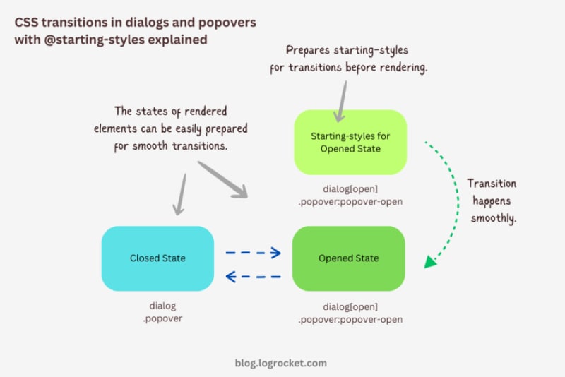
Advanced dialog animations with @starting-style
Let’s take it one step further by implementing different animations for dialog elements. The baseline remains the same: only the properties related to transformations and transitions will change.
Rotating-in-out dialogs
The idea behind creating a stylish rotating dialog box involves playing with the opacity and a couple of CSS transformation properties:
.my-dialog {
  transition: opacity 0.5s, translate 0.5s, rotate 0.5s,
              overlay 0.5s allow-discrete,
              display 0.5s allow-discrete;
}
The starting styles for the open state of the dialog include the following:
- Zero percent opacity to make it initially transparent
- A translation of -50 percent along the x-axis to shift the dialog from the center to the left
- A translation of -100 percent along the y-axis to move the dialog outside the visible viewport
- A rotation of -180 degrees to prepare it for positive rotation when opened
Here’s the code:
@starting-style {
  .my-dialog[open] {
    opacity: 0;
    translate: -50% -100%;
    rotate: -180deg;
  }
}
The closed state resembles the starting styles but with altered translations and rotations to reflect an opposite movement when exiting the dialog element:
.my-dialog {
  /* Previous styles */
  opacity: 0;
  translate: 50% 100%;
  rotate: 180deg;
}
The dialog element in the open state has 100 percent opacity, no translation on either axis, and no rotation, effectively positioning it at the center of the screen:
.my-dialog[open] {
  opacity: 1;
  translate: 0 0;
  rotate: 0deg;
}
The final output looks something like below:
See the Pen HTML5 Dialog and popover rotating animation by Rahul (@_rahul) on CodePen.
Bouncing in-out dialogs
To create a bouncing effect without using CSS keyframe animations, we can utilize a Bezier curve as the transition-timing function for the transformation and opacity transitions of our dialog. We’ll use the scale transformation for this effect.
Feel free to experiment with different x1, y1, x2, and y2 values for the Bezier curve, and implement them in your animation projects:
.my-dialog {
  transition: opacity 0.4s cubic-bezier(0.4, 1.6, 0.4, 0.8),
              scale 0.4s cubic-bezier(0.4, 1.6, 0.4, 0.8),
              overlay 0.4s allow-discrete,
              display 0.4s allow-discrete;
}
Now we can easily determine the starting styles and the open and closed states. The initial styles for the open and closed states will be the same — the dialog box will be scaled down to zero and completely transparent.
In the open state, the dialog box will have 100 percent opacity and be scaled to one. The rest of the transition effects will be handled by the Bezier curve-powered transitions:
@starting-style {
  .my-dialog[open] {
    opacity: 0;
    scale: 0;
  }
}

.my-dialog {
  opacity: 0;
  scale: 0;

  &[open] {
    opacity: 1;
    scale: 1;
  }
}
Here’s how this looks in action:
See the Pen HTML5 Dialog and popover bouncing animation by Rahul (@_rahul) on CodePen.
Sliding and bouncing dialogs
We will use the same Bezier curve in this animation to keep things simple, but the effect will be different compared to the previous one. The idea is to translate the dialogue along the y-axis instead of scaling it, as we did with the last effect:
.my-dialog {
  transition:
    opacity 0.5s cubic-bezier(0.4, 1.6, 0.4, 0.8),
    translate 0.5s cubic-bezier(0.4, 1.6, 0.4, 0.8),
    overlay 0.5s allow-discrete,
    display 0.5s allow-discrete;
}
The idea is to keep the dialog way up the viewport on the y-axis initially. Then, we will transform the dialog to zero when it is opened and finally translate it down the axis:
@starting-style {
  .my-dialog[open] {
    opacity: 0;
    translate: 0 -200%;
  }
}

.my-dialog {
  opacity: 0;
  translate: 0 200%;

  &[open] {
    opacity: 1;
    translate: 0 0;
  }
}
Instead of applying a 100 percent positive or negative translation, I doubled it to create the impression of urgency in the dialog box. See it in action below:
See the Pen HTML5 Dialog and popover slide-up-down bouncing animation by Rahul (@_rahul) on CodePen.
Subtle popover animations with @starting-style
The above effects suit the dialog elements well, but they won’t look great with the popover elements. This section is dedicated to some nice popover animation effects, which make the popover look like popovers and nothing more.
Rising-sinking popover
This effect resembles the popover effect we created initially. In that example, the popover appeared from the top and slide-fading down the y-axis, which isn’t what you’d expect from a popup in the bottom-right corner of the viewport.
Let’s rectify that by adding the same translation on the y-axis for the starting styles and the close state. Everything else remains unchanged:
See the Pen Rising up and down popover animation by Rahul (@_rahul) on CodePen.
Growing and shrinking popover
The process of creating a growing and shrinking effect is simple and involves the use of scale transformation with a twist.
By setting the transformation origin to the absolute bottom-right, we can ensure that the popover expands from the right, aligning with its current position at the bottom-right.
See the Pen Growing and shrinking popover animation by Rahul (@_rahul) on CodePen.
The toast popover
This technique is commonly used to create animations for notification toasts. To achieve this effect, you simply need to translate the popover element 100 percent to the right, putting it out of the viewport. Then, in the open state, you can translate it back to zero to complete the effect.
See the Pen Slide in out from right popover animation by Rahul (@_rahul) on CodePen.
Conclusion
We learned about incorporating CSS transition-based animations in dialog and popover elements using pure CSS. We discussed the complexities and issues of traditional transitioning with overlay elements, and then we addressed these problems one by one using CSS keyframes and, more importantly, the @starting-style at-rule, which is specially developed for transitions.
However, the @starting-style feature is fairly new and not yet available globally. Consequently, using CSS keyframes and the Web Animation API is an option that makes sense in production and provides more granular control over adding animation effects.
Having said that, I recommend the @starting-style approach once it gets adopted widely to keep things simple and lightweight with CSS transition applications.
Is your frontend hogging your users' CPU?
As web frontends get increasingly complex, resource-greedy features demand more and more from the browser. If you’re interested in monitoring and tracking client-side CPU usage, memory usage, and more for all of your users in production, try LogRocket.
LogRocket is like a DVR for web and mobile apps, recording everything that happens in your web app, mobile app, or website. Instead of guessing why problems happen, you can aggregate and report on key frontend performance metrics, replay user sessions along with application state, log network requests, and automatically surface all errors.
Modernize how you debug web and mobile apps — start monitoring for free.
-
 PHP陣列鍵值異常:了解07和08的好奇情況PHP數組鍵值問題,使用07&08 在給定數月的數組中,鍵值07和08呈現令人困惑的行為時,就會出現一個不尋常的問題。運行print_r($月)返回意外結果:鍵“ 07”丟失,而鍵“ 08”分配給了9月的值。 此問題源於PHP對領先零的解釋。當一個數字帶有0(例如07或08)的前綴時,PHP將...程式設計 發佈於2025-07-01
 -
解決Spring Security 4.1及以上版本CORS問題指南彈簧安全性cors filter:故障排除常見問題 在將Spring Security集成到現有項目中時,您可能會遇到與CORS相關的錯誤,如果像“訪問Control-allo-allow-Origin”之類的標頭,則無法設置在響應中。為了解決此問題,您可以實現自定義過濾器,例如代碼段中的MyFi...程式設計 發佈於2025-07-01
-
為什麼儘管有效代碼,為什麼在PHP中捕獲輸入?在php ;?>" method="post">The intention is to capture the input from the text box and display it when the submit button is clicked.但是,輸出...程式設計 發佈於2025-07-01
-
MySQL中如何高效地根據兩個條件INSERT或UPDATE行?在兩個條件下插入或更新或更新 solution:的答案在於mysql的插入中...在重複鍵更新語法上。如果不存在匹配行或更新現有行,則此功能強大的功能可以通過插入新行來進行有效的數據操作。如果違反了唯一的密鑰約束。 實現所需的行為,該表必須具有唯一的鍵定義(在這種情況下為'名稱'...程式設計 發佈於2025-07-01
-
如何同步迭代並從PHP中的兩個等級陣列打印值?同步的迭代和打印值來自相同大小的兩個數組使用兩個數組相等大小的selectbox時,一個包含country代碼的數組,另一個包含鄉村代碼,另一個包含其相應名稱的數組,可能會因不當提供了exply for for for the uncore for the forsion for for ytry...程式設計 發佈於2025-07-01
-
在Pandas中如何將年份和季度列合併為一個週期列?pandas data frame thing commans date lay neal and pree pree'和pree pree pree”,季度 2000 q2 這個目標是通過組合“年度”和“季度”列來創建一個新列,以獲取以下結果: [python中的concate...程式設計 發佈於2025-07-01
-
如何修復\“常規錯誤:2006 MySQL Server在插入數據時已經消失\”?How to Resolve "General error: 2006 MySQL server has gone away" While Inserting RecordsIntroduction:Inserting data into a MySQL database can...程式設計 發佈於2025-07-01
-
左連接為何在右表WHERE子句過濾時像內連接?左JOIN CONUNDRUM:WITCHING小時在數據庫Wizard的領域中變成內在的加入很有趣,當將c.foobar條件放置在上面的Where子句中時,據說左聯接似乎會轉換為內部連接。僅當滿足A.Foo和C.Foobar標準時,才會返回結果。 為什麼要變形?關鍵在於其中的子句。當左聯接的右側...程式設計 發佈於2025-07-01
-
同實例無需轉儲複製MySQL數據庫方法在同一實例上複製一個MySQL數據庫而無需轉儲在同一mySQL實例上複製數據庫,而無需創建InterMediate sqql script。以下方法為傳統的轉儲和IMPORT過程提供了更簡單的替代方法。 直接管道數據 MySQL手動概述了一種允許將mysqldump直接輸出到MySQL cli...程式設計 發佈於2025-07-01
-
如何在Java字符串中有效替換多個子字符串?在java 中有效地替換多個substring,需要在需要替換一個字符串中的多個substring的情況下,很容易求助於重複應用字符串的刺激力量。 However, this can be inefficient for large strings or when working with nu...程式設計 發佈於2025-07-01
-
eval()vs. ast.literal_eval():對於用戶輸入,哪個Python函數更安全?稱量()和ast.literal_eval()中的Python Security 在使用用戶輸入時,必須優先確保安全性。強大的Python功能Eval()通常是作為潛在解決方案而出現的,但擔心其潛在風險。本文深入研究了eval()和ast.literal_eval()之間的差異,突出顯示其安全性含義...程式設計 發佈於2025-07-01
-
如何簡化PHP中的JSON解析以獲取多維陣列?php 試圖在PHP中解析JSON數據的JSON可能具有挑戰性,尤其是在處理多維數組時。 To simplify the process, it's recommended to parse the JSON as an array rather than an object.To do...程式設計 發佈於2025-07-01
-
編譯器報錯“usr/bin/ld: cannot find -l”解決方法錯誤:“ usr/bin/ld:找不到-l “ 此錯誤表明鏈接器在鏈接您的可執行文件時無法找到指定的庫。為了解決此問題,我們將深入研究如何指定庫路徑並將鏈接引導到正確位置的詳細信息。 添加庫搜索路徑的一個可能的原因是,此錯誤是您的makefile中缺少庫搜索路徑。要解決它,您可以在鏈接器命令中添...程式設計 發佈於2025-07-01
-
為什麼不使用CSS`content'屬性顯示圖像?在Firefox extemers屬性為某些圖像很大,&& && && &&華倍華倍[華氏華倍華氏度]很少見,卻是某些瀏覽屬性很少,尤其是特定於Firefox的某些瀏覽器未能在使用內容屬性引用時未能顯示圖像的情況。這可以在提供的CSS類中看到:。 googlepic { 內容:url(&...程式設計 發佈於2025-07-01
-
如何從PHP中的Unicode字符串中有效地產生對URL友好的sl。為有效的slug生成首先,該函數用指定的分隔符替換所有非字母或數字字符。此步驟可確保slug遵守URL慣例。隨後,它採用ICONV函數將文本簡化為us-ascii兼容格式,從而允許更廣泛的字符集合兼容性。 接下來,該函數使用正則表達式刪除了不需要的字符,例如特殊字符和空格。此步驟可確保slug僅包...程式設計 發佈於2025-07-01


學習中文
- 1 走路用中文怎麼說? 走路中文發音,走路中文學習
- 2 坐飛機用中文怎麼說? 坐飞机中文發音,坐飞机中文學習
- 3 坐火車用中文怎麼說? 坐火车中文發音,坐火车中文學習
- 4 坐車用中文怎麼說? 坐车中文發音,坐车中文學習
- 5 開車用中文怎麼說? 开车中文發音,开车中文學習
- 6 游泳用中文怎麼說? 游泳中文發音,游泳中文學習
- 7 騎自行車用中文怎麼說? 骑自行车中文發音,骑自行车中文學習
- 8 你好用中文怎麼說? 你好中文發音,你好中文學習
- 9 謝謝用中文怎麼說? 谢谢中文發音,谢谢中文學習
- 10 How to say goodbye in Chinese? 再见Chinese pronunciation, 再见Chinese learning


