
The Solar System in CSS
 Browse:214
The Solar System has been done in CSS a lot of times — just search Codepen! So why do it again?
Because things get better and simpler — and we can now do a responsive solar system with just a few lines of CSS.
Let's start with some very basic markup:
We use an ordered list, because the planets are in order.
Next, we unset the default
- -styles, and style it as a grid:
- is this:
@keyframes rotate { to { offset-distance: 100%; } }And that's all! I asked ChatGPT to calculate the timings based on "Neptune", with a rotation-speed of 20s — and we get:
Conclusion
With just a few rules, we created a simple 2d version of the Solar System in pure CSS. If you want to dive deeper, you can:
- use real distances and sizes (with calc())
- add a transform: rotateX(angle) to the
- to make it pseudo-3D:

... and maybe use matrix3d to "re-flatten" the planets?
Happy coding!
ol {
  all: unset;
  aspect-ratio: 1 / 1;
  container-type: inline-size;
  display: grid;
  width: 100%;
}
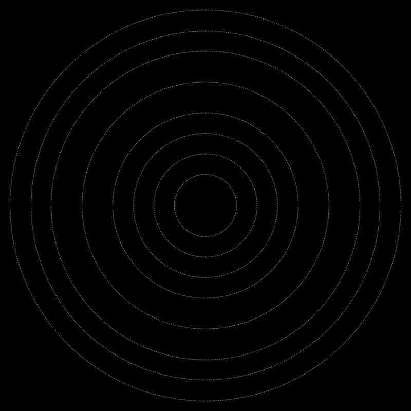
Now, for the planet trajectories, we're going to use a "grid stack". Instead of position: absolute, and a bunch of translations, we can simply stack all the grid items with:
li {
  grid-area: 1 / -1;
  place-self: center;
}
By setting a --d-variable (for diameter) per planet, using width: var(--d);, we get:
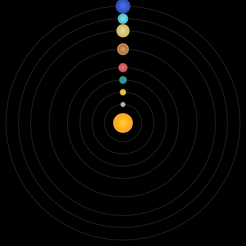
Cool! Let's add the planets using an ::after pseudo-element:
li::after {
  aspect-ratio: 1 / 1;
  background: var(--b);
  border-radius: 50%;
  content: '';
  display: block;
  width: var(--w, 2cqi);
}
Let's ask ChatGPT to generate some nice radial-gradents for each planet — and while we're at it, let's tell it we're creating the Solar System and ask for planetary sizes between 1 and 6cqi — not completely accurate, but still maintaining a sizeable, recognizable difference:
.mercury {
  --b: radial-gradient(circle, #c2c2c2 0%, #8a8a8a 100%);
  --w: 2.0526cqi;
}

.venus {
  --b: radial-gradient(circle, #f4d03f 0%, #c39c43 100%);
  --w: 2.6053cqi;
}

.earth {
  --b: radial-gradient(circle, #3a82f7 0%, #2f9e44 80%, #1a5e20 100%);
  --w: 3.1579cqi;
}

.mars {
  --b: radial-gradient(circle, #e57373 0%, #af4448 100%);
  --w: 3.7105cqi;
}

.jupiter {
  --b: radial-gradient(circle, #d4a373 0%, #b36d32 50%, #f4e7d3 100%);
  --w: 4.8158cqi;
}

.saturn {
  --b: radial-gradient(circle, #e6dba0 0%, #c2a13e 100%);
  --w: 5.3684cqi;
}

.uranus {
  --b: radial-gradient(circle, #7de3f4 0%, #3ba0b5 100%);
  --w: 4.2632cqi;
}

.neptune {
  --b: radial-gradient(circle, #4c6ef5 0%, #1b3b8c 100%);
  --w: 6cqi;
}
And now we have:
To animate the planets with different trajectory speeds, we add:
li::after {
  /* previous styles */
  animation: rotate var(--t, 3s) linear infinite;
  offset-path: content-box;
}
Notice the offset-path. That's the key to simplifying the trajectory-animations, because all we have to do to move the planet along the shape of the
-
 How to Handle User Input in Java's Full-Screen Exclusive Mode?Handling User Input in Full Screen Exclusive Mode in JavaIntroductionWhen running a Java application in full screen exclusive mode, the usual event ha...Programming Posted on 2025-07-21
 -
Why can't Java create generic arrays?Generic Array Creation ErrorQuestion:When attempting to create an array of generic classes using an expression like:public static ArrayList<myObjec...Programming Posted on 2025-07-21
-
How to pass exclusive pointers as function or constructor parameters in C++?Managing Unique Pointers as Parameters in Constructors and FunctionsUnique pointers (unique_ptr) uphold the principle of unique ownership in C 11. Wh...Programming Posted on 2025-07-21
-
When to use "try" instead of "if" to detect variable values in Python?Using "try" vs. "if" to Test Variable Value in PythonIn Python, there are situations where you may need to check if a variable has...Programming Posted on 2025-07-21
-
How can I safely concatenate text and values when constructing SQL queries in Go?Concatenating Text and Values in Go SQL QueriesWhen constructing a text SQL query in Go, there are certain syntax rules to follow when concatenating s...Programming Posted on 2025-07-21
-
Async Void vs. Async Task in ASP.NET: Why does the Async Void method sometimes throw exceptions?Understanding the Distinction Between Async Void and Async Task in ASP.NetIn ASP.Net applications, asynchronous programming plays a crucial role in en...Programming Posted on 2025-07-21
-
How to efficiently insert data into multiple MySQL tables in one transaction?MySQL Insert into Multiple TablesAttempting to insert data into multiple tables with a single MySQL query may yield unexpected results. While it may s...Programming Posted on 2025-07-21
-
How to dynamically discover export package types in Go language?Finding Exported Package Types DynamicallyIn contrast to the limited type discovery capabilities in the reflect package, this article explores alterna...Programming Posted on 2025-07-21
-
How to solve the error "Cannot guess file type, use application/octet-stream..." in AppEngine?AppEngine Static File MIME Type OverrideIn AppEngine, static file handlers can occasionally override the correct MIME type, resulting in the error mes...Programming Posted on 2025-07-21
-
Python efficient way to remove HTML tags from textStripping HTML Tags in Python for a Pristine Textual RepresentationManipulating HTML responses often involves extracting relevant text content while e...Programming Posted on 2025-07-21
-
Do I Need to Explicitly Delete Heap Allocations in C++ Before Program Exit?Explicit Deletion in C Despite Program ExitWhen working with dynamic memory allocation in C , developers often wonder if it's necessary to manu...Programming Posted on 2025-07-21
-
Why Doesn't `body { margin: 0; }` Always Remove Top Margin in CSS?Addressing Body Margin Removal in CSSFor novice web developers, removing the margin of the body element can be a confusing task. Often, the code provi...Programming Posted on 2025-07-21
-
What is the difference between nested functions and closures in PythonNested Functions vs. Closures in PythonWhile nested functions in Python superficially resemble closures, they are fundamentally distinct due to a key ...Programming Posted on 2025-07-21
-
How Can I Maintain Custom JTable Cell Rendering After Cell Editing?Maintaining JTable Cell Rendering After Cell EditIn a JTable, implementing custom cell rendering and editing capabilities can enhance the user experie...Programming Posted on 2025-07-21
-
How to Check if an Object Has a Specific Attribute in Python?Method to Determine Object Attribute ExistenceThis inquiry seeks a method to verify the presence of a specific attribute within an object. Consider th...Programming Posted on 2025-07-21


Study Chinese
- 1 How do you say "walk" in Chinese? 走路 Chinese pronunciation, 走路 Chinese learning
- 2 How do you say "take a plane" in Chinese? 坐飞机 Chinese pronunciation, 坐飞机 Chinese learning
- 3 How do you say "take a train" in Chinese? 坐火车 Chinese pronunciation, 坐火车 Chinese learning
- 4 How do you say "take a bus" in Chinese? 坐车 Chinese pronunciation, 坐车 Chinese learning
- 5 How to say drive in Chinese? 开车 Chinese pronunciation, 开车 Chinese learning
- 6 How do you say swimming in Chinese? 游泳 Chinese pronunciation, 游泳 Chinese learning
- 7 How do you say ride a bicycle in Chinese? 骑自行车 Chinese pronunciation, 骑自行车 Chinese learning
- 8 How do you say hello in Chinese? 你好Chinese pronunciation, 你好Chinese learning
- 9 How do you say thank you in Chinese? 谢谢Chinese pronunciation, 谢谢Chinese learning
- 10 How to say goodbye in Chinese? 再见Chinese pronunciation, 再见Chinese learning


